
A preschool site built from one reference photo, with a booking flow that needs no server at all
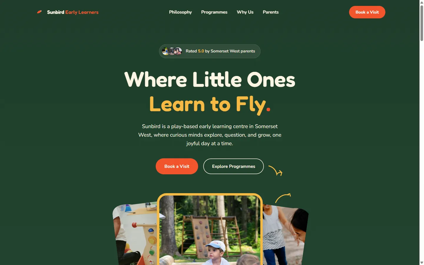
Sunbird is our concept build for a fictional Cape Town preschool: a full, animation-led website matched to a single reference image, with a working visit-booking and enrolment flow that runs entirely in the visitor's browser.
Snapshot
- Client
- Sunbird Early Learners (a GoodGround concept brand)
- Industry
- Early childhood education, direct to parents
- Services
- Design, front-end build, booking UX, SEO setup
- Build
- Hand-written HTML, CSS and JavaScript. No framework, no build step, no backend.
The challenge
A client sent us one reference photo of a website they liked and asked for something that felt the same, without copying it outright. That's a harder brief than it sounds: match the feeling and structure of someone else's design closely enough that it clearly did its job as a reference, while making sure the finished site has its own name, its own colours, its own voice, and never reads as a copy with the logo swapped out.
On top of that, every 'Book a Visit' and 'Apply Now' button on a typical preschool site is usually just a link to a contact form, or worse, a dead link that goes nowhere. We wanted to build the real thing: a working booking and enrolment flow a parent could actually use, without a server, a database, or anyone on the other end to make it feel genuine.
The solution
One reference photo, turned into a whole site's worth of decisions
We started by describing the reference image back in detail: the deep green hero, the cut-out photo shapes, the stats sitting on the seam between two sections, the mascot doodles, the big oversized name in the footer. Then we rebuilt each of those ideas with Sunbird's own colours, its own mascot, and copy written specifically for a Cape Town audience.
The result reads as its own brand rather than a reskin: the same warm, playful feeling as the reference, the same structure, but nothing borrowed outright.
A booking button that actually books something
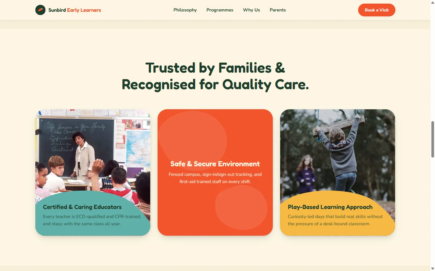
Every 'Book a Visit' button on the site, and the 'Apply Now' button in the closing section, opens the same pop-up window with a real form: parent and child's names, contact details, the age group, and either a preferred visit date or a preferred starting term, depending on which button was clicked.
Fill it in and submit, and it behaves like a real booking system would: checking the form is filled in properly, showing a brief sending state, then confirming back with a message built from what was actually typed in (the child's name, the programme, and the date or term chosen). Nothing is sent anywhere, since there's no real preschool on the other end, but every part of the experience works exactly as it would if there were.
Caught by looking twice, not just once
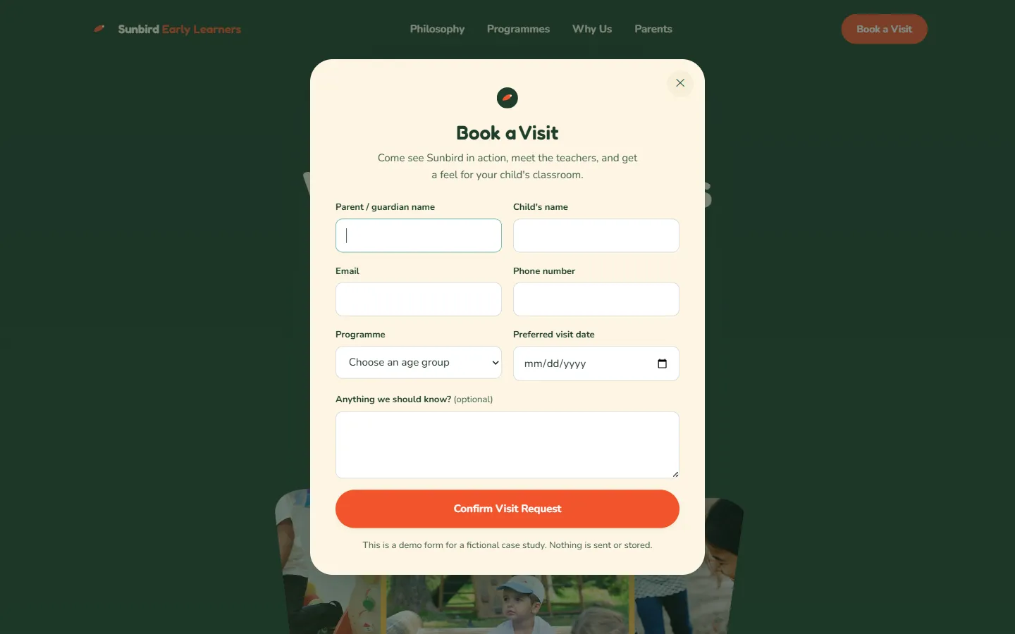
Every part of this site was screenshotted, checked, fixed, and screenshotted again, on a full-size screen, a tablet, and a phone. That habit is what caught the real problems: navigation text that was invisible against the dark background, a mobile menu that left a faint stripe behind when it closed, and a photo that overlapped the heading text on small phones.
It also caught something smaller but just as real: a couple of photo captions that didn't actually match what was in the photo. Easy to miss on a quick glance, obvious the moment you look properly, which is the whole point of checking twice.
Two sections rebuilt after a second reference came in
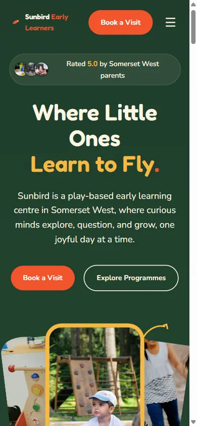
Partway through, the client sent two more reference images and asked for the equivalent sections to be added. Rather than bolt them on as extra content and end up with two sections both explaining why the school could be trusted, we replaced the closest matching sections with the new approach, so the page still reads as one considered whole rather than a page that grew by accident.
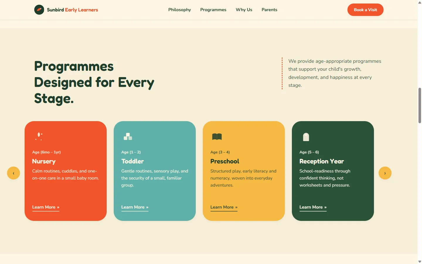
The programmes section became a scrollable set of age-based cards with its own working previous and next controls, and each card's 'Learn More' link opens the booking pop-up with that exact age group already selected: a small detail, but one that saves a parent from re-explaining what they just clicked on.
The results
Every figure below was measured on the live URL. Each one tells you how to check it yourself.
5 files
Entire site
View source on the live URL: index.html, styles.css, script.js, robots.txt and sitemap.xml. No bundler output, no framework.
0
Console errors
Open the Console on the live URL.
0
Broken requests
Open the Network panel on the live URL and reload: every request returns 200.
44px
Minimum touch target size
Inspect the mobile nav toggle or the gallery lightbox controls in DevTools: every tappable control measures at least 44×44px.
2 in 1
Booking flows, one pop-up
Click any 'Book a Visit' button, then 'Apply Now' in the closing section: same pop-up, two different forms.
Sunbird Early Learners is a fictional brand with no real families or enrolments, so like our other concept builds, there's no traffic or booking data to report, and we're not going to invent any. The site also carries a deliberate noindex tag and a Disallow in robots.txt, so a made-up preschool doesn't turn up in real search results. Every number above can be checked directly in your own browser.