
A one-page booking site with a real pricing engine, no backend
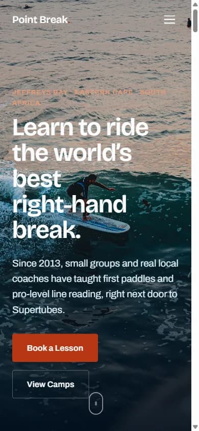
Point Break is our concept build for a surf school in Jeffreys Bay: lessons, camps, coaches, and an instant custom quote, all on one page that loads almost immediately.
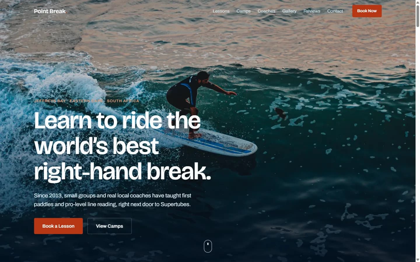
Snapshot
- Client
- Point Break Surf Academy (a GoodGround concept brand)
- Industry
- Adventure travel and sports coaching, direct to consumer
- Services
- Design, front-end build, booking UX, SEO setup
- Build
- Hand-written HTML, CSS and JavaScript. No framework, no build step, no backend.
The challenge
Most one-page booking sites fall into one of two traps. Either they're a brochure that funnels every enquiry through a single generic contact form, hiding the details people actually want to know (how long, how many people, what's included) behind a phone call. Or they try to become a real booking system and end up needing months of backend development before the first lesson is even listed.
We set out to prove there's a middle path. Four different things a visitor might want to book (lessons, camp packages, meeting a coach, or building their own custom trip) all needed to live on one scrolling page, each with real depth behind a click. And the price calculator had to feel instant and alive, as if it were checking with someone in real time, even though nothing was happening anywhere but in the visitor's own browser.
The solution
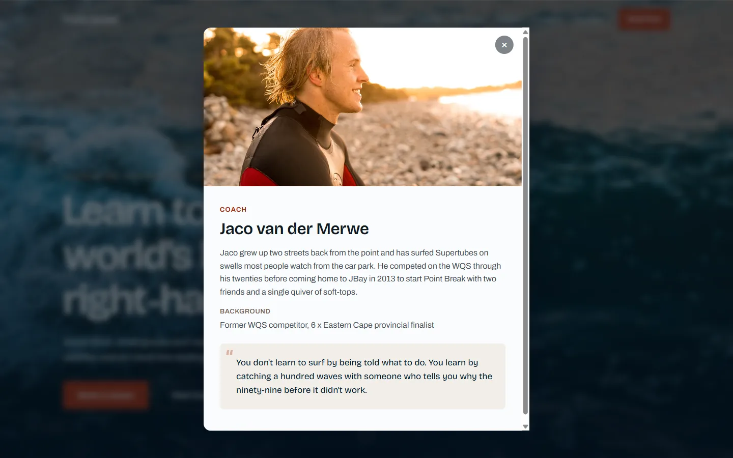
One pop-up window, doing four different jobs
Lesson details, camp itineraries, coach bios and the booking form all open in the exact same style of pop-up window: a photo at the top, scrollable details below, and the same familiar way of closing it, whether that's the X, clicking outside, or hitting Escape. We built that one pop-up once, and every card on the page just fills it with different content.
The booking pop-up in particular can be opened from almost anywhere on the page, and it always remembers what the visitor was already looking at: if you were checking the price for a family camp package, that's exactly what shows up when you go to book.
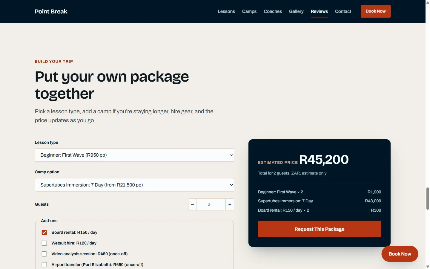
A price calculator with nothing to talk to
The package builder updates a full quote (lesson type, camp package, extras, number of guests) the instant anyone changes a selection. There's no waiting, no spinner, no delay, because there's nothing anywhere else it needs to check with. Everything happens right there in the browser.
Every line in the price breakdown comes from exactly the same information that produces the total, so the two can never disagree with each other, which is the thing that makes most online quote tools feel untrustworthy.
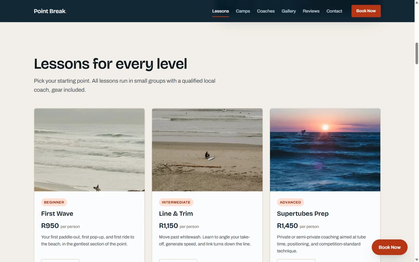
Pricing tiers that read like tiers, not a template
The three lesson options and three camp packages are laid out the same way, because they need to be easy to compare side by side. But each one has its own photograph, its own specific inclusions, and a real description of what you'll actually get, not the generic icon-and-heading treatment that makes most pricing pages look interchangeable.
That distinction matters most in the details people actually weigh up before booking: how many people are in the group, how long it runs, and what actually happens in the lesson, not just the price tag.
Built mobile-first, because that is how it gets booked
Most people booking a trip like this do it from their phone, often while they're already travelling. So the whole layout was designed for a phone screen first, then built up to fit a laptop, not the other way around. Every part of the page was checked on the smallest and largest screens we could think of, with nothing ever spilling off the edge.
One dropdown menu with long text once quietly pushed part of the layout wider than it should have been. A small bug, the kind that only shows up once you actually test on a real device instead of assuming a design will hold, caught before it ever reached a real visitor.
The results
Every figure below was measured on the live URL. Each one tells you how to check it yourself.
331 ms
Largest Contentful Paint
Record a performance trace against the live URL in Chrome DevTools.
0.00
Cumulative Layout Shift
Same trace, same run.
100
Lighthouse Accessibility
Run Lighthouse against the live URL in Chrome DevTools.
100
Lighthouse Agentic Browsing
Same audit, same run.
5 files
Entire site
View source on the live URL: one HTML file, one stylesheet, one script, robots.txt and sitemap.xml. No bundler output.
0
Console errors
Open the Console on the live URL.
Point Break Surf Academy is a fictional brand with no customers, so like B3TTER, there is no traffic, bookings or revenue to report, and the six testimonials on the page are invented and disclosed as such in the footer. The site also carries a deliberate noindex tag and a Disallow in robots.txt, which is why its own Lighthouse SEO score reads around 66 rather than 100: a made-up surf school has no business ranking in real search results. Every other SEO check on the page passes, and removing those two lines is a one-line change if this pattern is ever reused for a real client.