
The studio holds itself to the same brief it gives clients
This is our own site, built and held to the same standard we hold every client site to: fast, accessible, and honestly checked against the live version anyone can visit, not a private staging copy.

Snapshot
- Client
- GoodGround (the studio itself)
- Industry
- Website design and development studio, South Africa
- Services
- Design, front-end build, SEO, ongoing iteration
- Build
- Next.js 16, Tailwind v4, GSAP and Framer Motion, deployed on Vercel.
The challenge
A studio's own website is where every shortcut it would never let a client take suddenly becomes tempting. There's no client waiting on a deadline, and no one watching to notice if a claim about speed or accessibility quietly stops being true. It's a familiar trap: the agency that sells fast, accessible websites while running one that doesn't live up to its own pitch.
So we held this site to the exact same bar as our other work: real checks on the live version, not a private build; an honest audit rather than an assumed clean bill of health; and every fix checked again after it was made, rather than trusted from memory. This case study exists because that audit turned up real problems, and this is the record of fixing them.
The solution
An audit run against ourselves, not just clients
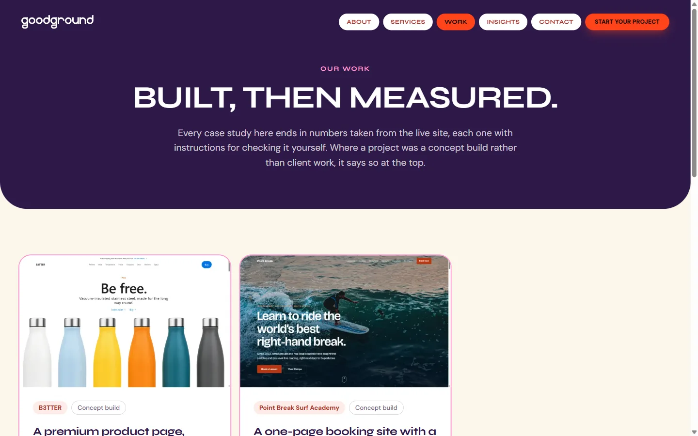
The audit that produced this case study found sixteen pages that all shared the exact same social-media preview image instead of their own, a leftover note telling search engines our work page was 'coming soon' when it had been live for weeks, and a work page that gave one project a big featured spot while the rest sat smaller below it, quietly suggesting it mattered more than the others.
Every one of those got fixed in the same pass: all sixteen pages now generate their own proper preview image, the outdated note was corrected, and the work page was rebuilt so every case study, including this one, appears at exactly the same size and weight, with no favourites.
An animation the audit flagged as broken, that wasn't
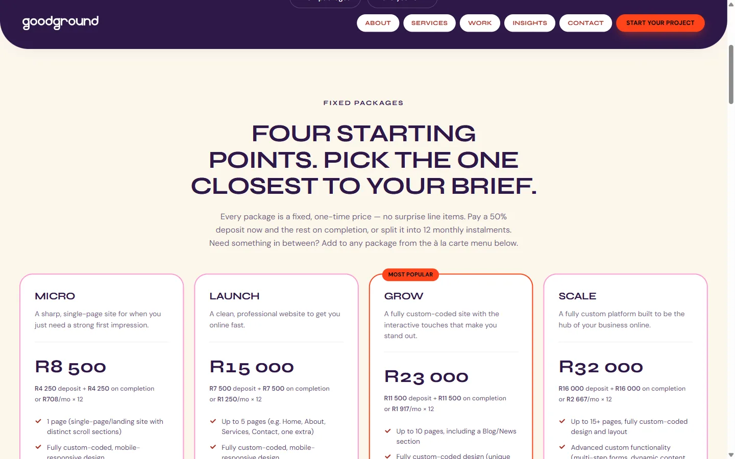
The same audit also reported that a small light animation on our recommended pricing card had stopped working, based on a screenshot that showed it sitting still. But checking the actual page over time told a different story: the light was moving exactly as it was supposed to.
The likely explanation: a screenshot only ever catches one single frozen instant of a slow, looping animation, and any frozen instant of something in motion looks like it's standing still. It's a useful reminder that looking at a picture of a page and watching the real thing aren't the same test, and this case study only fixes what was actually found, not what a screenshot happened to catch by accident.
Numbers that hold up on the real domain
Every number in the results section below was measured against the real, live website, not a local copy on someone's laptop, and not a guess. If a claim about speed or accessibility is going to mean anything, it has to hold up on the site people actually visit.
The site itself is intentionally unglamorous under the hood: nearly every page is built in advance rather than assembled on the fly, so visitors are served a ready-made page rather than waiting on a server to build one just for them.
Built mobile-first, same as every other project here
The same care that went into B3TTER and Point Break went into this site too: nothing was designed for a laptop screen and then awkwardly squeezed onto a phone afterwards, and every animated element respects a visitor's request for less motion.
The difference here is what's at stake. If a client's site had a small layout bug, it would just be an embarrassing fix. If this site has one, it's us failing to keep the exact promise we make to everyone else.

The results
Every figure below was measured on the live URL. Each one tells you how to check it yourself.
100
Lighthouse Accessibility
Run Lighthouse against www.goodground.co.za in Chrome DevTools.
100
Lighthouse Best Practices
Same audit, same run.
100
Lighthouse SEO
Same audit, same run.
772 ms
Largest Contentful Paint
Record a performance trace against the live homepage in Chrome DevTools.
0.02
Cumulative Layout Shift
Same trace, same run.
48 pages
Statically generated at build time
Run a production build and read the route summary Next.js prints.
These numbers describe how the site is built, not how the business is performing: traffic, leads and client outcomes are real but aren't the subject of this page. Where they're relevant, they belong in a business update, not a build case study, and won't be invented here to fill the gap.