
B3TTER
- Year
- 2026
- Service
- Design & Front-End Development
- Details
- Hand-written HTML, CSS and JavaScript. No framework, no build step, no third-party requests.
The brief
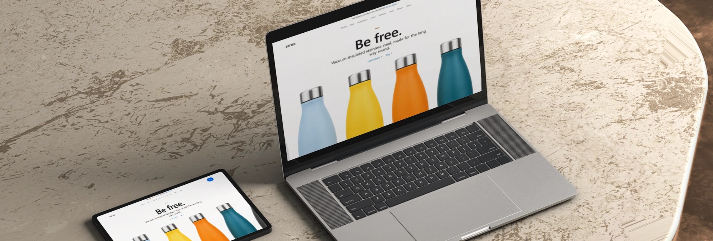
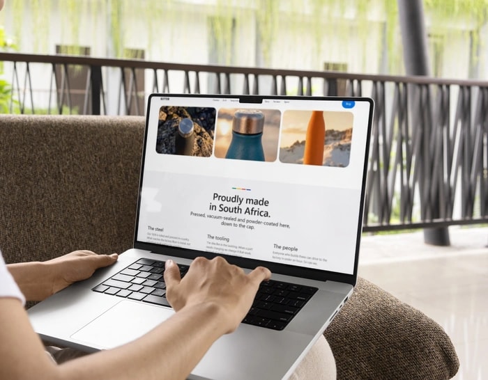
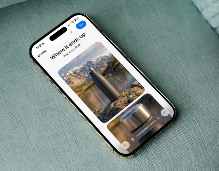
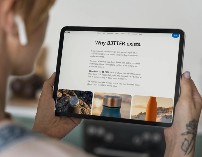
B3TTER needed a product page that could carry a premium single-item brand on its own: no supporting range, no category page to lean on, just one bottle that had to look and feel expensive from the first scroll.
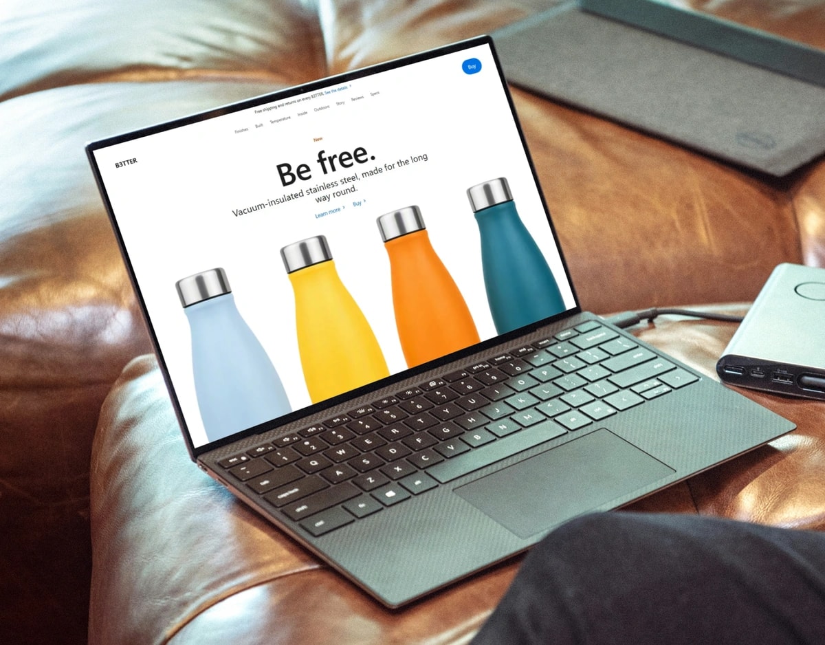
The clip below is a straight walkthrough of the finished site, recorded end to end rather than cut together from separate takes, so what you're seeing is exactly what a visitor gets.
Snapshot
- Client
- B3TTER (a GoodGround concept brand)
- Industry
- Outdoor gear, direct to consumer
- Services
- Design, front-end build, image optimisation, accessibility, SEO setup
The challenge
Most product pages for physical goods fail in the same two places. The photos are so heavy the page stalls on a phone, and the fun interactive bits (colour pickers, review sliders, photo galleries) are built assuming everyone uses a mouse, which leaves anyone relying on a keyboard or a screen reader stuck.
We wanted to prove both problems can be solved at once, without the page losing its premium feel. So we gave ourselves a tough brief: dozens of studio and lifestyle photos, a live colour switcher, a scrolling review carousel, and a rule that none of it could cost us a single point on accessibility.
The solution
We took each problem in turn: colour without clutter, a specifications section people actually read, photography that stays light, and accessibility that's checked rather than assumed. Here's how each one was built.
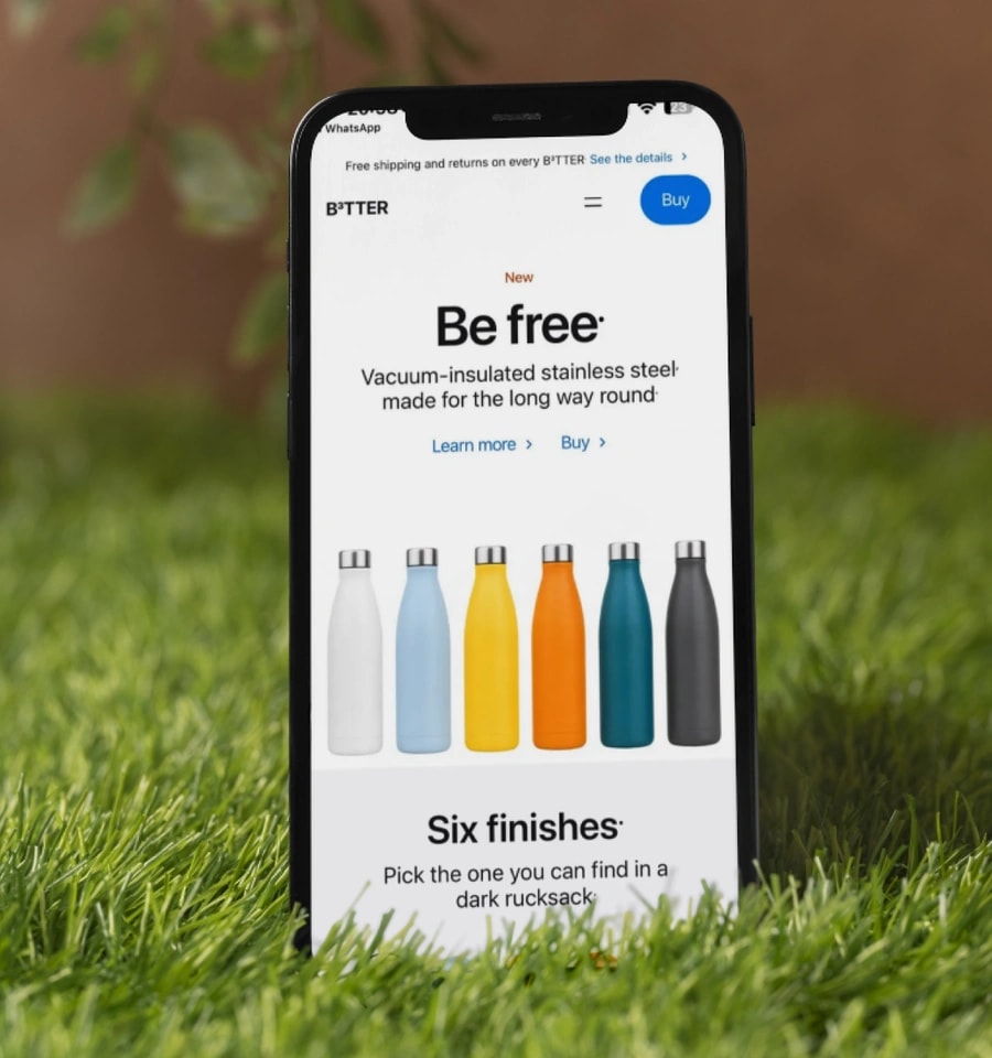
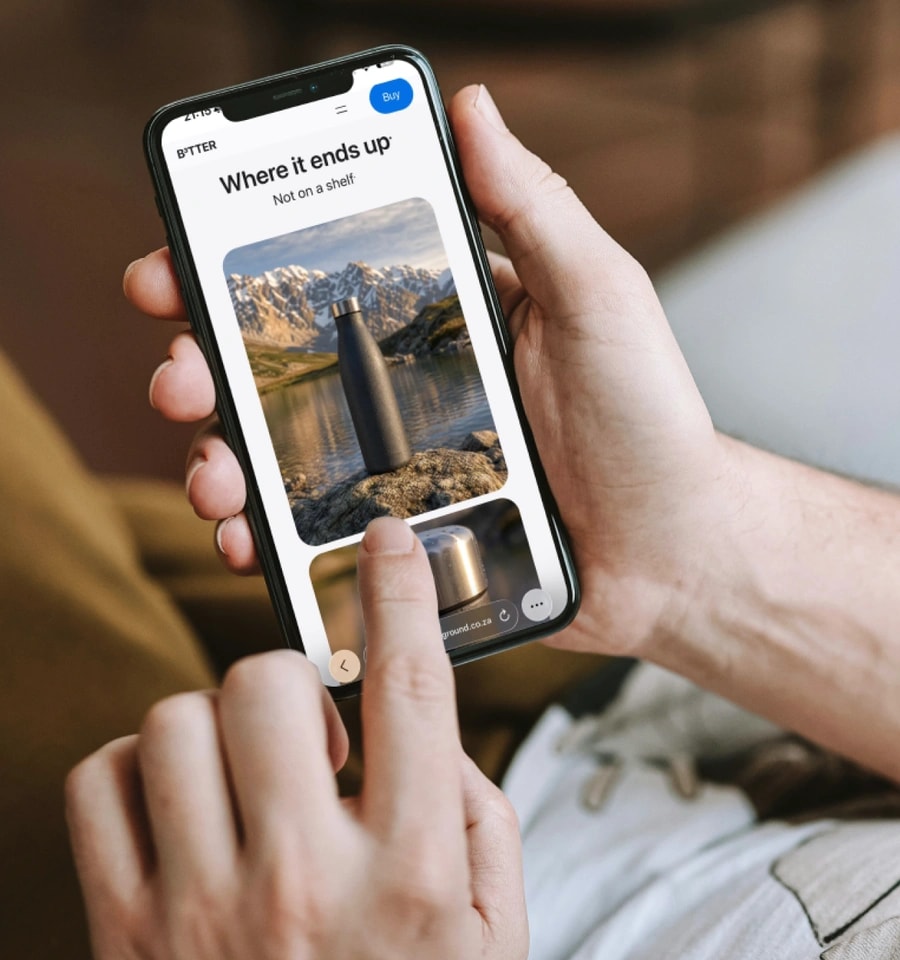
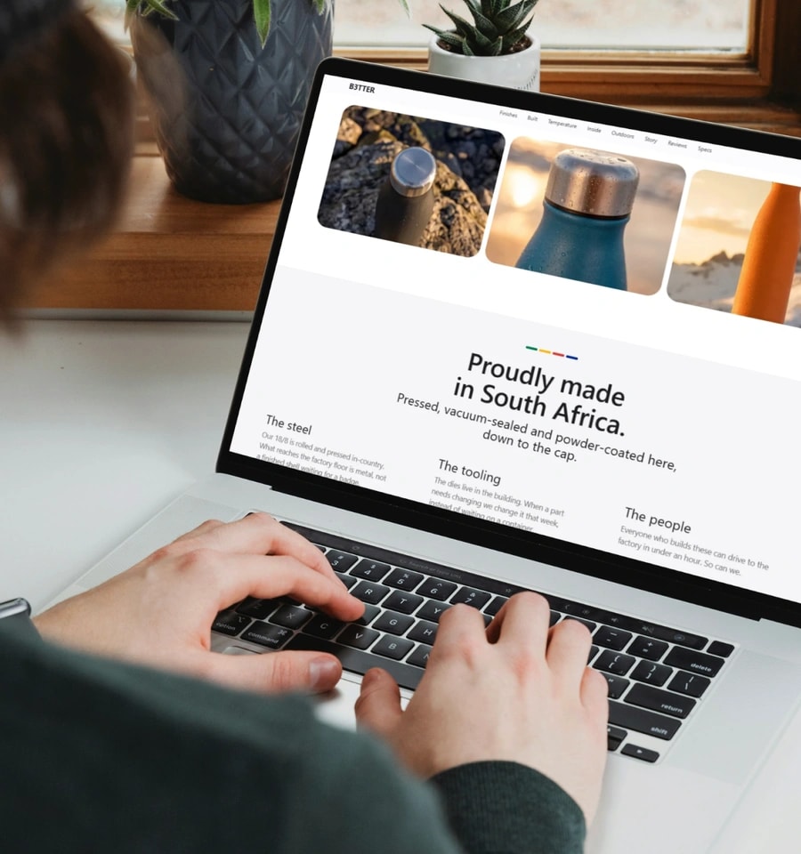
The product carries the colour, the interface stays silent
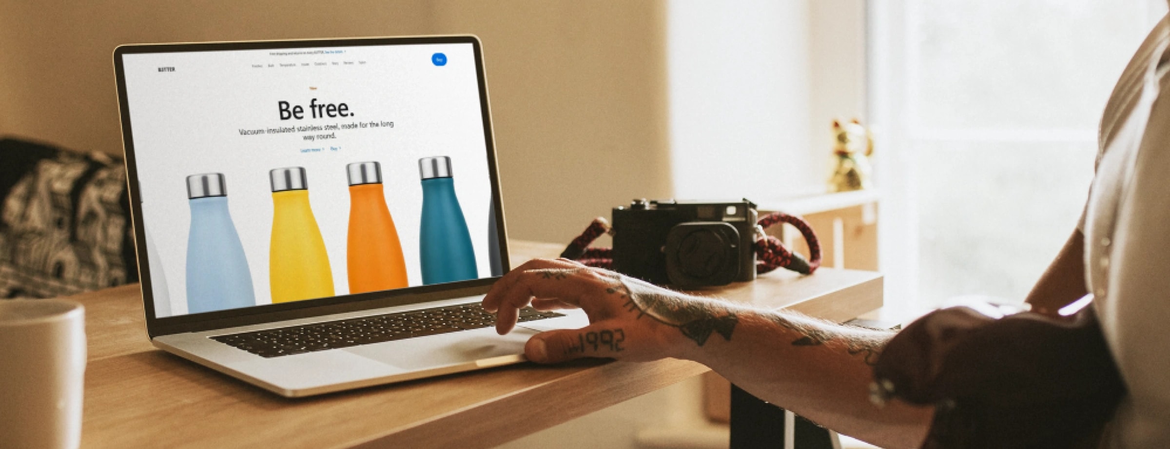
The entire interface is black and white. Every bit of colour on the page comes from the bottle itself, which is what makes a six-colourway range actually feel like a range, instead of decoration slapped on top.
Clicking a colour swatch smoothly fades between six real photographs of the bottle, rather than just tinting one image. Every photo is ready before you click, so there's never a flash of white while it loads, and you can flip through colours with your arrow keys, not just a mouse.
A specifications section that doesn't feel like a spec sheet
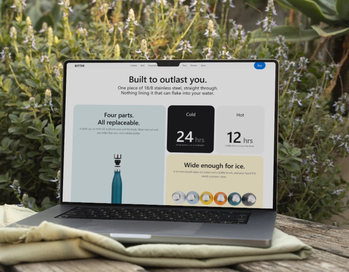
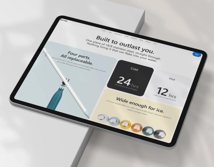
The specifications section uses a mix of large and small tiles instead of a row of identical boxes. Most websites default to a wall of matching cards, and mixing the sizes gives the eye somewhere to land instead of a flat, even grid.
It was built to fit perfectly on every screen size, with no odd gaps or leftover tiles. We checked every layout by hand, at every width, rather than eyeballing it and hoping.
56 MB of photography, shipped as 1.5 MB
Twenty-seven original photos came in at 56 MB combined, which is far too heavy for a fast-loading page. Every one was carefully compressed and resized to exactly the size it needed to be, with no wasted space around the product.
The finished page loads all of that photography in 1.5 MB total, with every cut-out product shot still perfectly transparent. Nothing on the page is fetched from anywhere else on the internet: no ad trackers, no font services, nothing slowing it down but the page itself.
Accessible because it was checked, not because it was assumed
Every interactive part of the page, the colour switcher, the review carousel, the mobile menu, works just as well with a keyboard as it does with a mouse. Screen readers are only told about the review that's actually on screen, and the carousel stops moving the instant anyone interacts with it.
And for anyone whose device is set to reduce motion, every animation on the page (the settling hero image, the scroll effects, the counting numbers) turns off completely rather than just slowing down.
The results
Every figure below was measured on the live URL. Each one tells you how to check it yourself.
100
Lighthouse Accessibility
Run Lighthouse against the live URL in Chrome DevTools.
100
Lighthouse Best Practices
Same audit, same run.
56 MB → 1.5 MB
Photography payload
Compare the source renders with the shipped assets in the Network panel.
0
Third-party requests
Open the Network panel and filter by domain. Everything is first-party.
0
Console errors
Open the Console on the live URL.
These are build-quality measurements, not business outcomes. B3TTER is a concept brand with no customers, so there is no traffic, revenue or conversion data to report, and we are not going to invent any. What these numbers show is how the page was built, and every one of them can be checked in your own browser in under a minute.